Dynamic Bubble Display in Power BI Scatter Charts: A Simple Solution
I recently stumbled upon a challenging requirement in Power BI: selectively showing or hiding bubbles in a Scatter Chart visual based on a specific difference value selected from a slicer. Initially, it seemed daunting, but I discovered a straightforward solution.
a final Implementation would look like below -
1. Sample Data Overview
We'll start with a sample dataset to demonstrate the dynamic bubble display feature in Power BI Scatter Charts. The data consists of the following columns:
2. Measures requirement
To plot the scatter chart in this demonstration, we would require mainly 2 majors and 1 data point as below-
One Data Point or Attributes
Columns named Project would be used as Data points or Attributes.
Two Measures
Total Sales = SUM(Sales[Sale Amount])
Profit % = [Profit]/[Total Sales]
Whereas Profit % calculation will be based on Profit Meausre that has to be calculated first -
Profit = SUM(Sales[Profit])
3. Create the Scatter graph using PowerBI Desktop
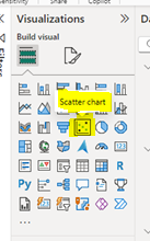
Click on Scatter Chart under the Visualizations section in Power BI to draw a Scatter chart.
Select the scatter chart and start building the visual by using above mentioned Data points and Measures, it should successfully plot the scatter chart -
Under Line Section
Name - Choose accordingly, I am putting Baseline as the name.
Value - It will plot the baseline in the chart as per the given percentage value, I am providing 0.06 which is equal to 6%.
Color - Choose accordingly, I am choosing Blue.
Transparency - Choose accordingly, I am leaving it to the default value.
Line Style - Choose accordingly, I am making it Solid.
Width - Choose accordingly, I am changing it to 2px.
Position - Choose accordingly, I am choosing Behind.
Under Data Label Section
Horizontal Position - Choose accordingly, I am choosing it as the Right.
Vertical Position - Choose accordingly, I am choosing it as Above.
Style - Choose accordingly, I am choosing it as Both (Data value and Name).
Color - Choose accordingly, I am choosing it as Black.
Display Units - Choose accordingly, I am leaving it to the default value.
Value Decimal Places - Choose accordingly, I am choosing it 2.
After the above configuration, the Scatter chart in PowerBI should look like as below, you can see a constant line has been added under the Y-Axis.
3. Add a Custom Difference Slicer that will show or hide bubbles based on selection
Create a custom static data table as Diff_BaseLine in the Power BI M query section as per the below detail -
You can change the name and value in Range, Min and Max columns as per your requirement.
Once the table is created successfully, click on Close and Apply.Create a Slicer and assign Range column from new Diff_BaseLine table in the Field box, and change the style of the slicer to Tile from Style in Options under the Slicer Settings.
Provide Title as Range, after all the configurational changes, slicer should look like as below -
Diff_Baseline =
Var _diff=0.06-[Profit %]
Var _min=SELECTEDVALUE(Diff_BaseLine[Min])
Var _max=SELECTEDVALUE(Diff_BaseLine[Max])
RETURN
IF(SELECTEDVALUE(Diff_BaseLine[Range])="All",1,IF(_diff >=_min && _diff <=_max,1,0))
In the above measure calculation logic, I put 0.06 as static value which is equal to 6%, you can choose the value as per your requirement.
After Measure creation, Select the Scatter chart and drag & drop this measure to the filter section, and set value to 1 from the advance property under filter section -
This was the last and final step of our implementation, you can perform the testing, Slicer selection should produce the expected result.
(End of blog)
Thank you for reading! I hope you found this tutorial informative and helpful. Your comments and feedback are greatly appreciated.


0 Comments